26 Moody Bedroom Ideas with Rich Colors and Warm Details
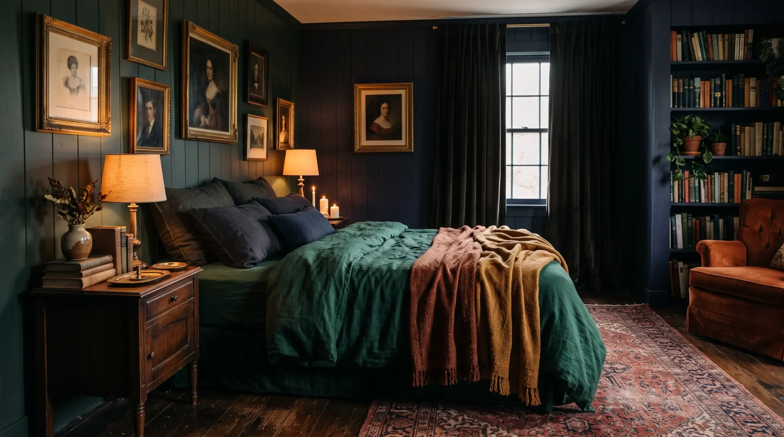
There is something about the first real chill of autumn that makes you look at your bedroom and think: this room needs to feel like a hug.
Suddenly the bright whites and breezy linens that felt so right in July start looking a little cold and unconvincing.
Fall is basically the universe giving you permission to go darker, warmer, and moodier with your space.
Everything you need to make your bedroom feel like a proper seasonal retreat is right here, from deep jewel-toned walls to layered textures that make you want to stay in bed until noon.
1. Burgundy Walls With Cream Bedding
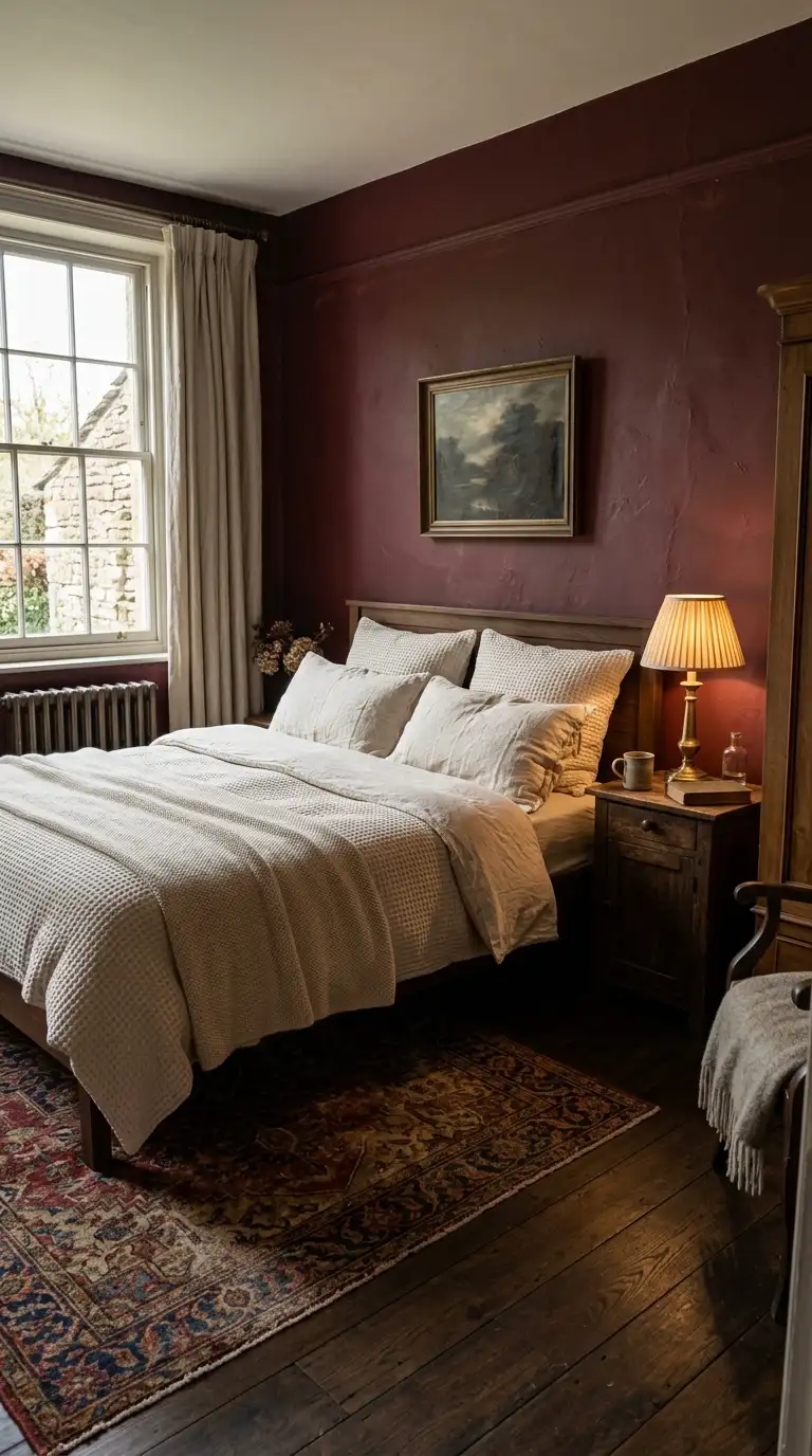
Burgundy is the colour that autumn was invented for, and your bedroom walls are the best place to prove it. It wraps the room in richness without feeling dark or cave-like when you pair it with the right contrast.
Cream bedding is exactly that contrast. Go for heavyweight cream cotton or a textured waffle-weave duvet cover that reads as soft and warm rather than crisp and clinical.
The trick most people miss is keeping the cream slightly off-white. Pure white against burgundy can feel too sharp, but ivory or natural linen tones make the whole thing feel intentional and expensive.
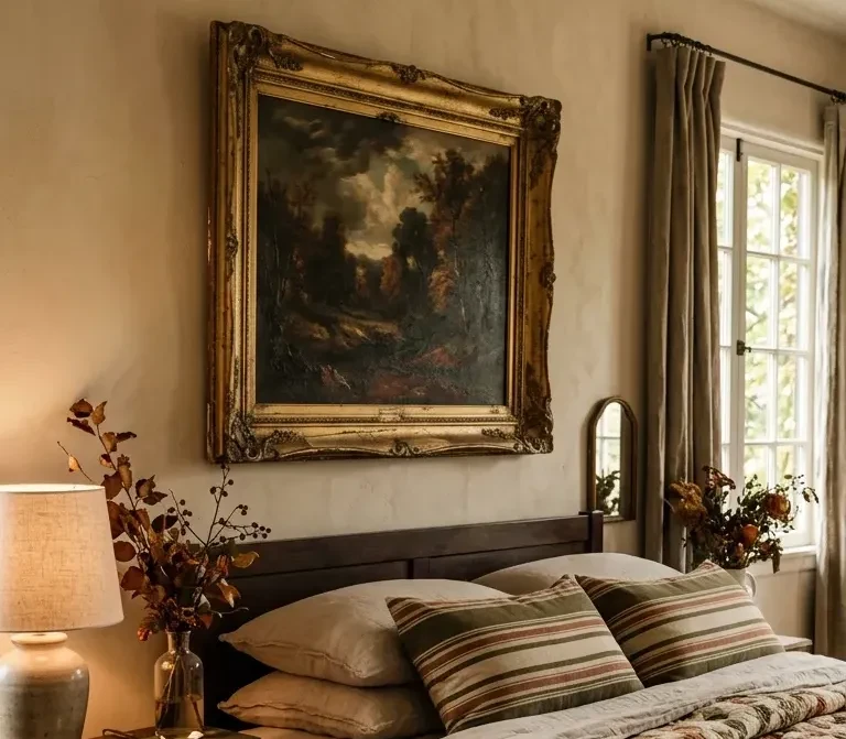
Add a single vintage-style lamp on the nightstand and you have a room that looks like it belongs in an old European country house. The kind of bedroom where people write novels and drink tea dramatically.
Finish with a woven jute rug or a faded Persian print underfoot to ground the palette without distracting from the walls.
Hey there! Some links on this page may be affiliate links which means that, if you choose to make a purchase, I may earn a small commission at no extra cost to you.
2. Moody Olive Green Bedroom
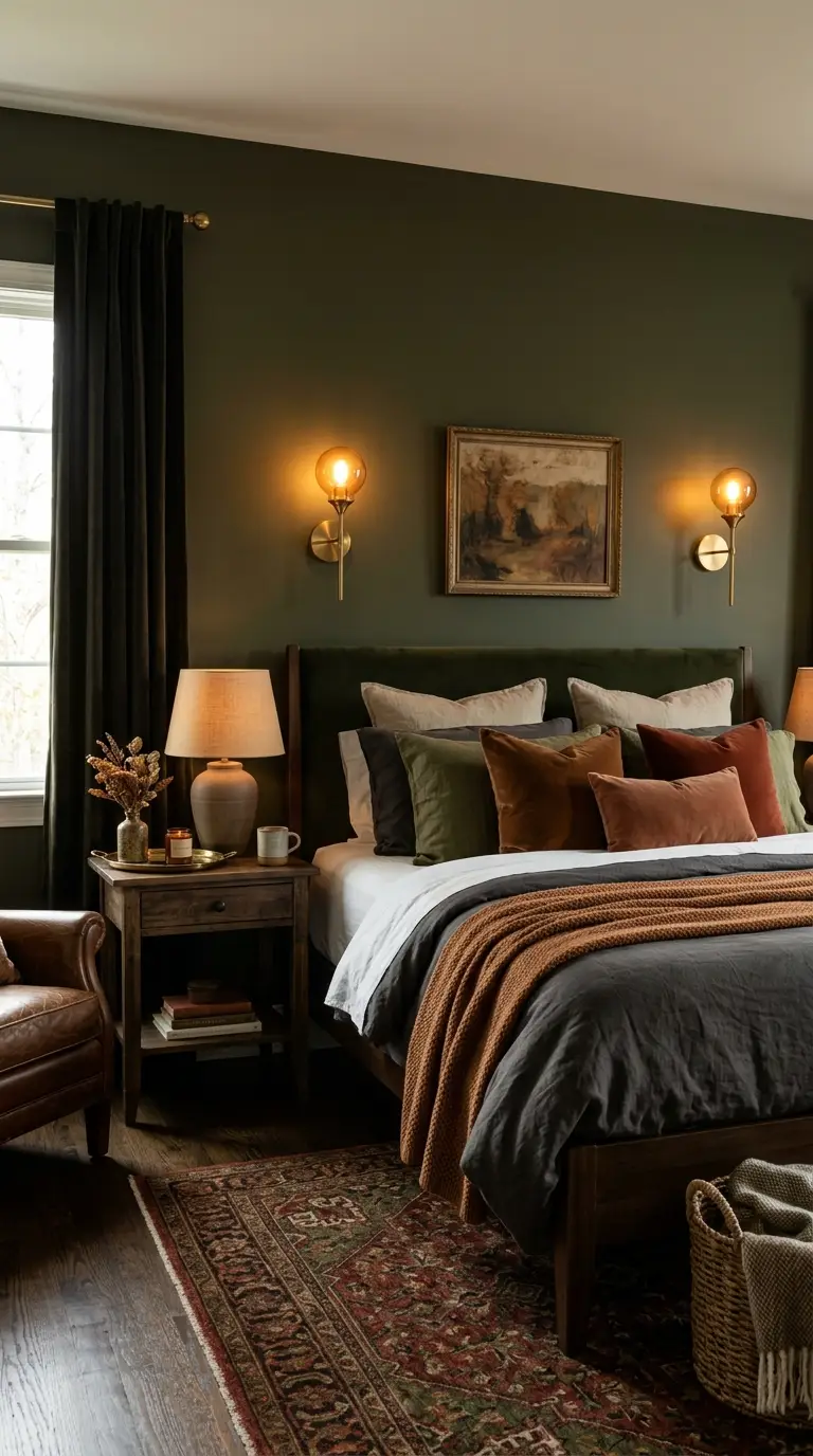
Olive green is having its long-overdue moment, and honestly it is about time. This is a green that feels nothing like a garden and everything like a warm, lived-in library.
The key to getting olive right is choosing a shade with a strong yellow or brown undertone. Avoid anything that leans too grey or it loses all that gorgeous warmth that makes moody olive so appealing.
Pair it with natural linen bedding in a sand or oat tone. Layer a chunky knit throw in a cognac or rust shade at the foot of the bed for that perfectly undone autumn feel.
Wooden furniture works beautifully here. A dark walnut bedside table or a honey-toned oak bed frame both sit happily against olive walls without competing for attention.
This palette is one of those combinations that feels calm and sophisticated without even trying. Low-effort luxury is very much the goal.
3. Chocolate Brown Color Drenched Walls
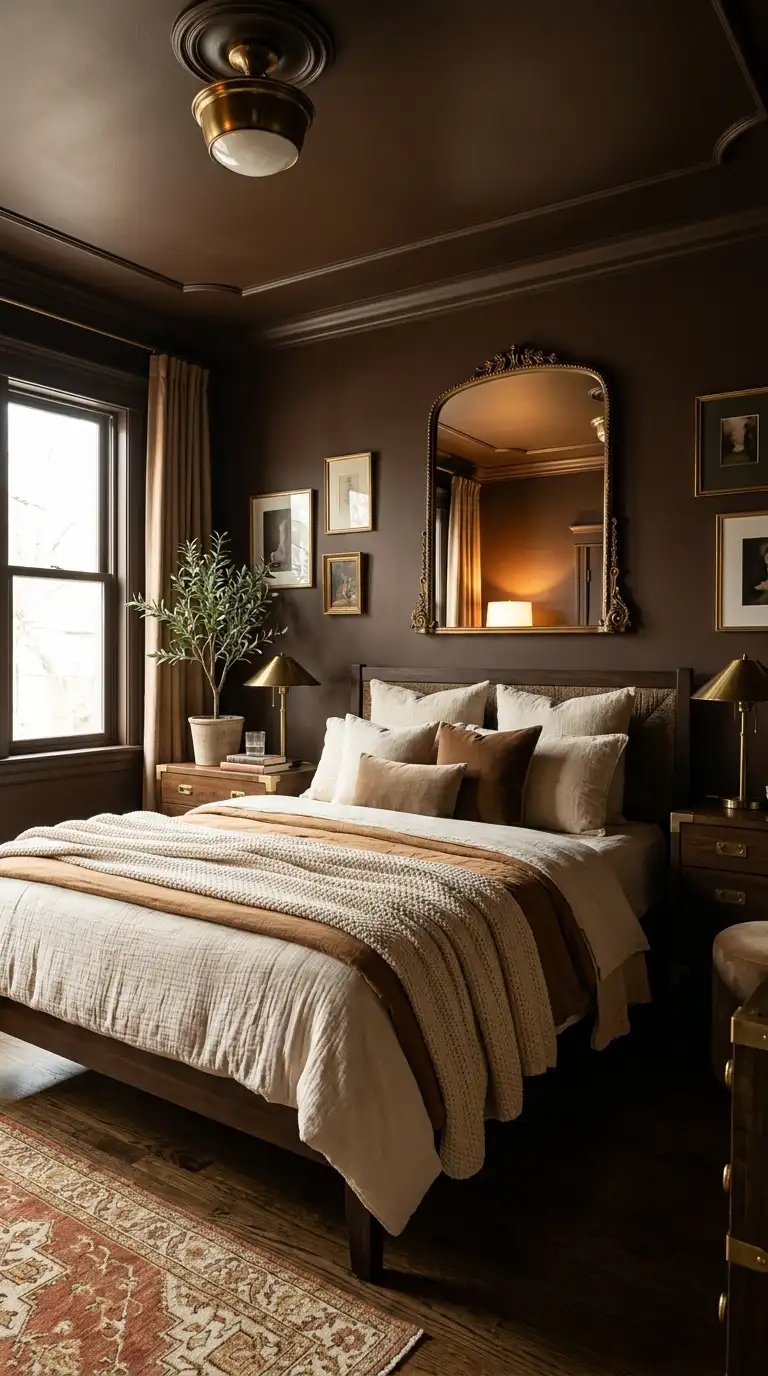
Colour drenching is the design move where you paint the walls, ceiling, and even the trim in the same shade, and chocolate brown is made for this treatment. It sounds intense and it absolutely is, in the best possible way.
When every surface is wrapped in the same deep brown, the room stops feeling like four walls and starts feeling like an experience. Rich, cocoon-like, and impossible to leave on a rainy morning.
Choose a brown with warm red or caramel undertones rather than cool grey-brown. A cool brown reads as muddy in low light while a warm one glows.
Bring in cream or caramel bedding to give your eye somewhere to rest. A single large mirror on one wall bounces light around and keeps the room from feeling too closed-in.
Brass hardware on furniture or fittings adds the final layer of warmth this palette needs. Even just swapping your light switch covers to a brushed gold finish makes a noticeable difference.
4. Smoky Blue Velvet Headboard
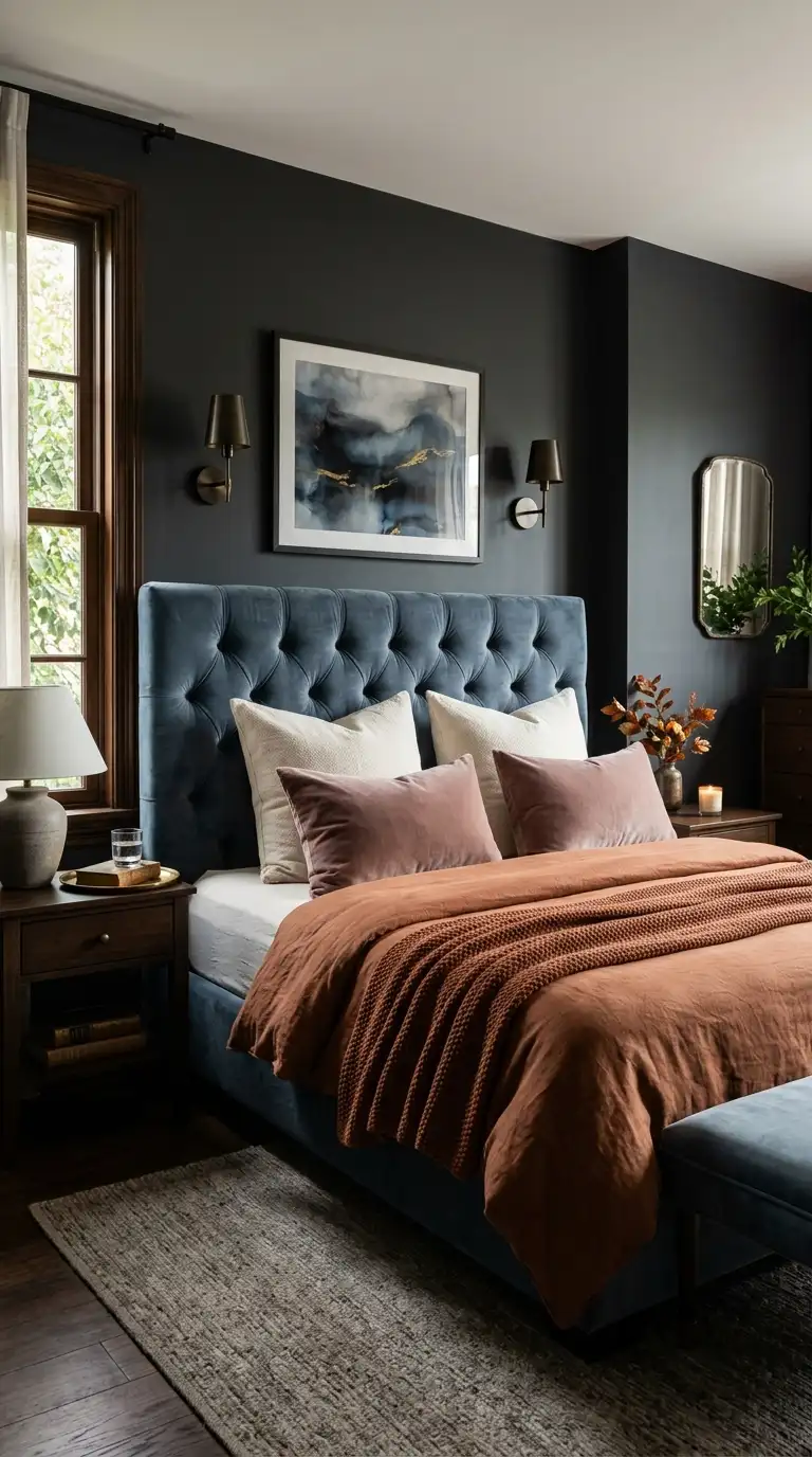
A velvet headboard does more work in a bedroom than most people realise. It functions as a focal point, a texture hit, and a whole design statement rolled into one piece of furniture.
Smoky blue specifically reads as moody rather than nautical or nursery-adjacent. Look for descriptions like “dusty teal,” “slate blue,” or “storm blue” when you are shopping to land in the right territory.
Position the headboard against a wall painted in a warm charcoal or soft white depending on the energy you want. A charcoal wall makes the whole arrangement feel very editorial and dramatic.
Dress the bed in layers of muted tones around it. Dusty rose, warm white, and a touch of rust in a throw pillow all work without fighting the blue for dominance.
The velvet texture catches light differently throughout the day and that quality alone makes the room feel alive without any extra effort from you.
5. Deep Plum Linen Bedding
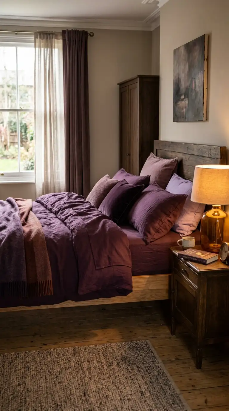

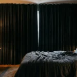
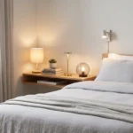
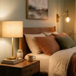
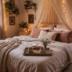
Plum bedding is one of those choices that feels slightly daring at first and then you wonder why you waited so long. It is rich enough to feel intentional but soft enough in linen fabric that it never overwhelms.
Linen is the fabric to choose here specifically because it has that natural rumpled quality that keeps plum from feeling too formal or heavy. Crisp cotton in this shade would veer into hotel territory.
Style the bed with layered pillows in dusty mauve, warm cream, and a deeper aubergine for depth. You are building a gradient effect that feels very curated without needing to think about it too hard.
A warm-toned bedside lamp in amber glass or antique brass is essential with this palette. It turns the plum tones from cool-leaning to genuinely warm and cosy.
Keep the rest of the room fairly neutral so the bedding does its full job. Plum can carry the entire room on its own if you let it.
6. Dark Wood Four Poster Bed
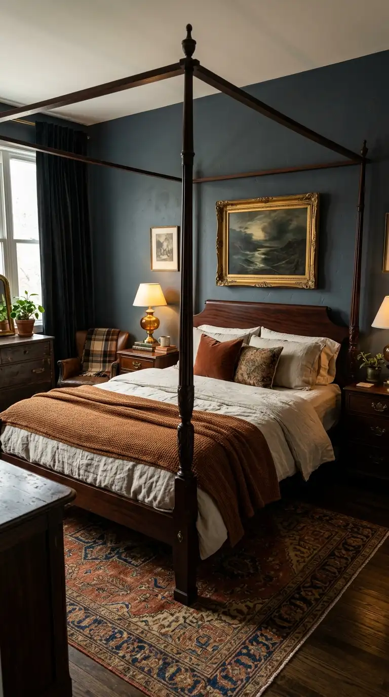
There is a reason dark wood four poster beds have survived centuries of interior design trends. They make a bedroom feel important in a way that nothing else quite replicates.
A four poster in a deep mahogany, espresso, or dark walnut finish immediately anchors the room with visual weight and drama. It tells the room who is in charge.
You do not need to go full canopy with heavy drapes unless you want to. Even bare posts in a dark wood finish give the same structural drama with a cleaner, more modern result.
Dress the bed in layers of warm neutral bedding against the dark frame. Oatmeal, cream, and a hint of rust in the textiles create a perfect counterbalance to all that dark wood.
Sourcing one of these secondhand is absolutely worth the effort. Vintage four posters found on resale apps or estate sales often cost less than flat-pack alternatives and have far more character.
7. Warm Brass Bedside Lighting
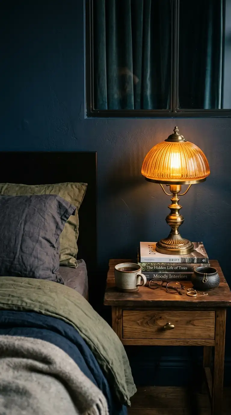
Lighting does more to create a moody bedroom than almost any other single element. And warm brass fixtures are the fastest way to shift your bedroom from functional to genuinely atmospheric.
The secret is layering rather than relying on one overhead light. A brass table lamp on each nightstand, paired with a dimmable warm bulb, creates that golden hour effect that makes everything feel softer.
Look for lamps with an amber glass shade or a natural linen shade rather than white. White shades throw bright, directional light while warm-toned shades diffuse it and create that sought-after glow.
Vintage brass and antique brass are not the same finish, so check before you buy. Vintage brass leans gold and shiny while antique brass has a darker, more muted quality that works better in moody spaces.
Your phone photos will also look dramatically better in this light. Completely unrelated to interior design but genuinely life-changing.
8. Charcoal Walls With Walnut Furniture
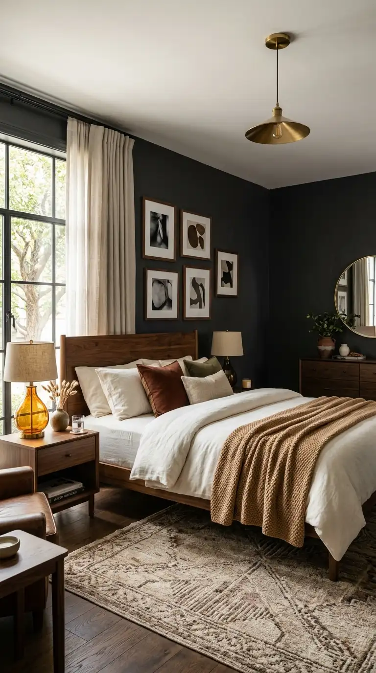
Charcoal and walnut is a pairing that belongs in the same category as red wine and good cheese. Both are better together than either would be alone.
The warmth of the walnut wood grain pulls any coolness out of the charcoal and makes the palette feel grounded and liveable rather than stark. This is a combination that works in both modern and traditional bedroom styles.
Choose a charcoal with a warm undertone rather than a blue-grey. Hold your paint samples against your furniture before committing because the undertone difference is significant in real light.
Cream or warm white bedding is the natural partner here. Layer in a textured knit throw in camel or rust to keep the textile story warm and cohesive.
Walnut frames for artwork or mirrors on charcoal walls look genuinely stunning. It is one of those combinations where the room starts to look like it was styled by someone who really knows what they are doing.
9. Burgundy And Olive Accents
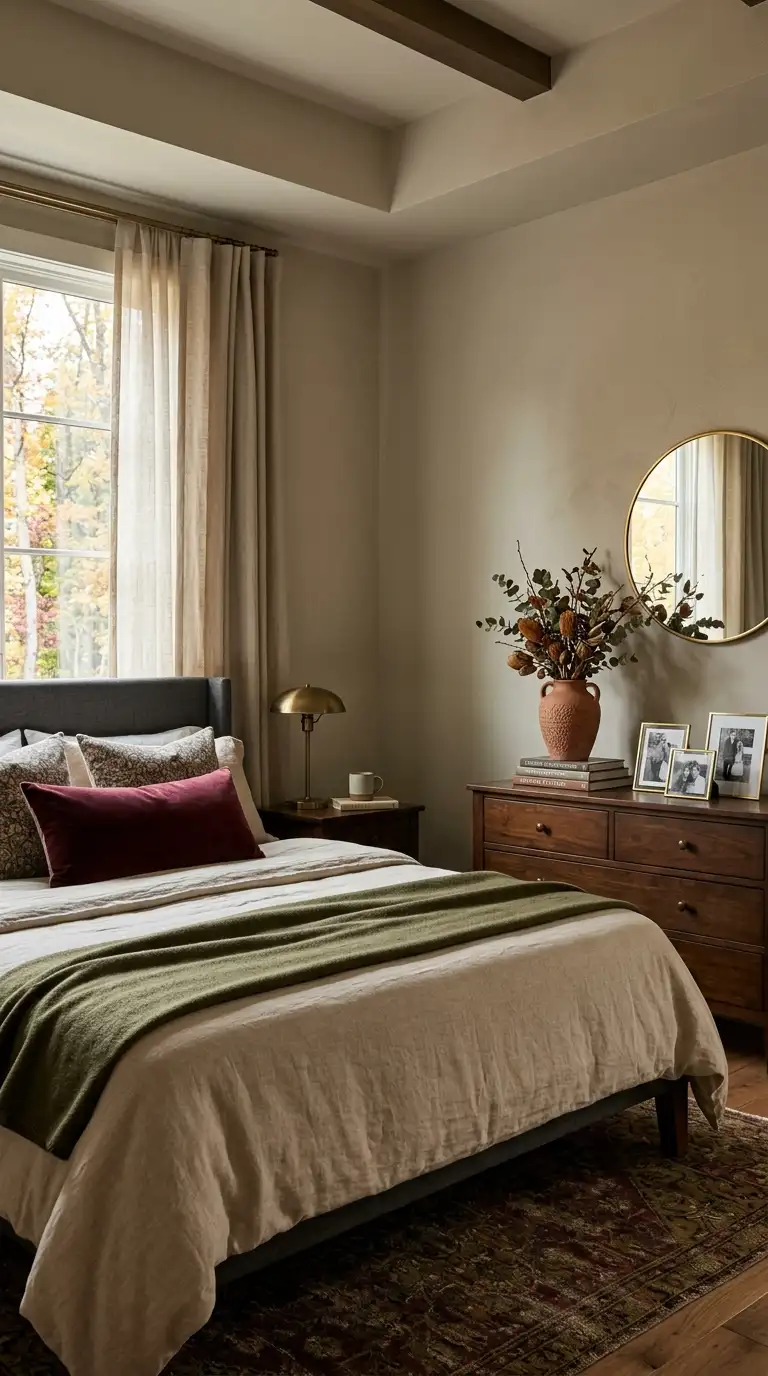
Using burgundy and olive as accent colours rather than wall colours is one of the most accessible ways to get that moody autumn bedroom without committing to a full repaint. This approach works especially well if you rent or if you are easing into a darker aesthetic.
Start with neutral walls in a warm greige or soft white and build the palette through textiles and accessories. A burgundy lumbar pillow, an olive throw, and a terracotta vase together create a colour story that feels rich and considered.
Vintage or antique-style accessories pull the palette together naturally. A brass photo frame, a dark wood box, or a small ceramic in any of these earthy tones connects the accent colours to the room.
Keep the balance roughly equal between the burgundy and olive tones so neither dominates. Too much burgundy reads as very bold while too much olive reads as understated, but together they find a perfect middle ground.
This is the approach for people who love the idea of a moody bedroom but also like to refresh their space seasonally without repainting every time.
10. Moody Floral Wallpaper Feature Wall
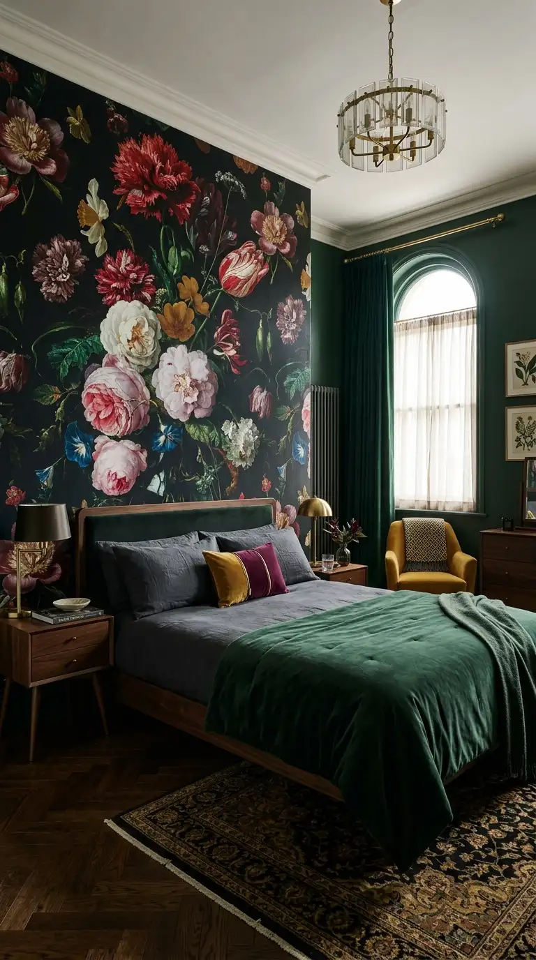



A feature wall with moody botanical wallpaper is a seriously powerful design move. Done right, it looks like something out of a high-end boutique hotel that you would absolutely screenshot on Instagram.
Dark-background floral wallpapers work on the wall directly behind the bed. That specific placement frames the bed beautifully and turns the headboard arrangement into a full composition.
Look for patterns with large-scale blooms in deep jewel tones on a black, navy, or deep forest green background. The scale matters because small prints on a dark background tend to read as busy and flat from across the room.
Keep the remaining three walls in a colour pulled from the wallpaper rather than going plain white. Matching even the deepest background shade across the walls makes the feature feel intentional rather than pasted-on.
Peel-and-stick wallpaper options have come a very long way in quality. Renters now have genuinely good options for creating this look without losing their deposit.
11. Cocooning Upholstered Headboard Design
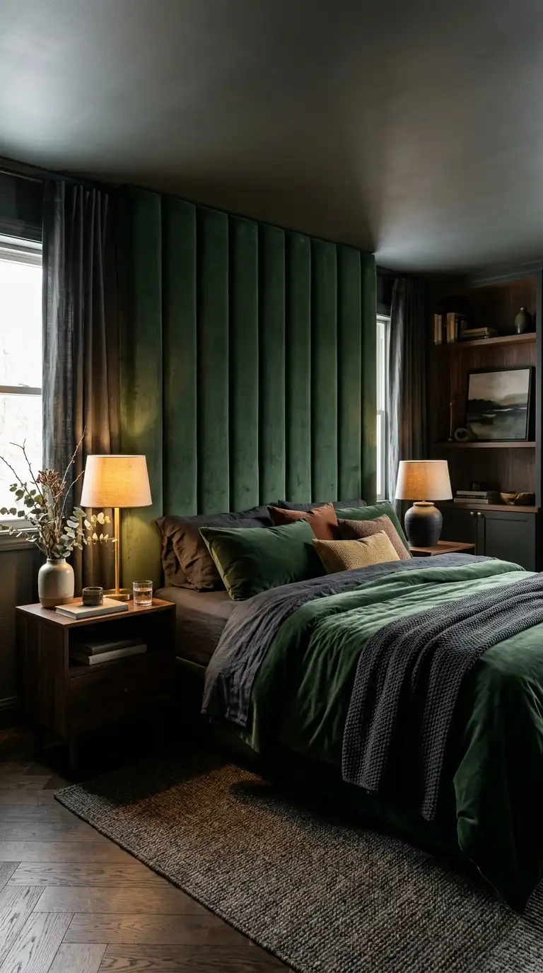
An upholstered headboard is one of those upgrades that changes how your room feels before you even change anything else. It adds softness, warmth, and the kind of quiet luxury that makes guests assume you spent far more than you did.
A floor-to-ceiling upholstered headboard in particular creates a cocooning effect that feels almost enveloping in the best way. You are essentially giving the bed its own padded room and it works beautifully in autumn.
Choose a fabric that adds texture as well as colour. Boucle, velvet, and linen are all strong choices while leather can feel too cool and hard-edged for the warm moody aesthetic you are going for.
Deep tones like forest green, warm mushroom, dusty rose, or slate blue work best. Avoid very pale or very bright upholstery because the power of this look is in the weight and richness of the colour.
Many furniture brands now sell upholstered headboards separately from bed frames. This means you can upgrade your existing bed without replacing it, which is an excellent use of your budget.
12. Rust Bedding With Dark Walls
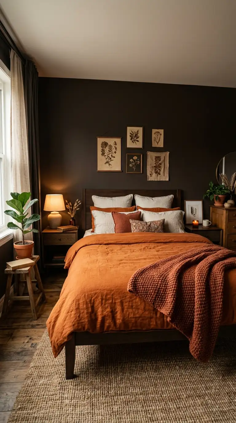
Rust bedding against dark walls might be the single most autumn-appropriate bedroom combination in existence. It is warm, bold, and looks like someone bottled October and poured it into your bedroom.
The best dark wall colours to pair with rust are deep charcoal, near-black forest green, or dark espresso brown. All three make the rust tones glow in a way that lighter walls simply cannot.
Look for rust bedding in washed cotton or vintage-dyed linen rather than bright orange-red. The slightly faded, earthy quality of a washed fabric is what gives this combination its depth and sophistication.
Layer in warm cream or oatmeal pillow covers alongside the rust to prevent the palette from feeling one-note. A chunky textured throw in a complementary terracotta or amber adds another dimension.
This is the bedroom that will make anyone who sees it immediately say “I want my room to look like this.” Consider yourself warned.
13. Aged Brass Against Deep Green
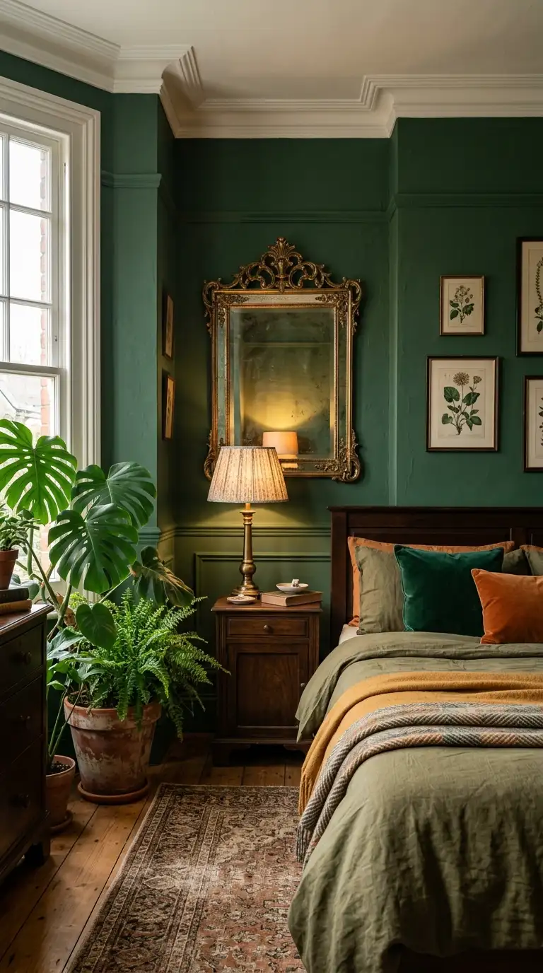
Aged brass and deep green is a combination borrowed directly from the Victorian conservatory and it belongs in your bedroom immediately. The botanical connection between the two creates a sense of richness that feels both vintage and very current.
Deep green here means forest green, hunter green, or a deeply saturated emerald rather than a sage or mint. The depth of the green is what makes the aged brass fittings come alive against it.
Aged brass has a slightly darkened, antique quality that differs from shiny polished brass. This specific finish sits in the warm zone without looking too yellow or too precious against the green.
Introduce the brass through lighting, mirror frames, curtain rods, and hardware rather than trying to source everything in the same exact finish. A mix of slightly varied brass tones actually reads as more natural and collected.
Plants are an obvious but genuinely effective addition to this palette. A large leaf in a terracotta or aged brass pot against deep green walls looks almost theatrical.
14. Layered Lighting For Cozy Ambiance
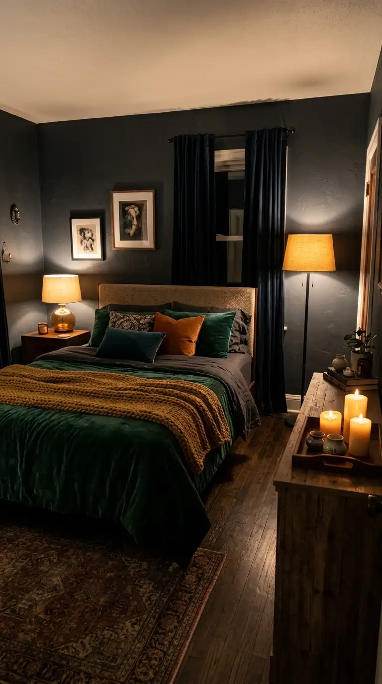
If your bedroom relies entirely on one ceiling light controlled by a wall switch, you are leaving enormous amounts of atmosphere on the table. Autumn is the perfect time to finally fix that.
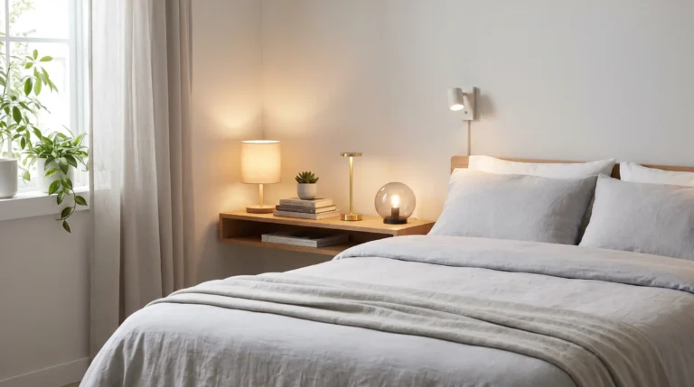
The goal is to have at least three light sources at different heights in the room. Bedside lamps, a floor lamp in a corner, and perhaps a strip of warm LED lighting behind a headboard or under a shelf all work together to build depth.
Dimmer switches are a relatively inexpensive upgrade that completely transforms how a bedroom feels in the evening. If you cannot add a dimmer to the main switch, opt for lamps with built-in dimmer switches or use smart bulbs that you can control from your phone.
Warm white bulbs in the 2700K to 3000K colour temperature range are non-negotiable. Anything brighter or cooler will cancel out every other cosy design choice you have made.
Candles count as a light source and should absolutely be part of your bedroom lighting plan. A few pillar candles on a tray on the dresser create warmth that no electric light can fully replicate.
15. Earthy Brown And Burgundy Palette
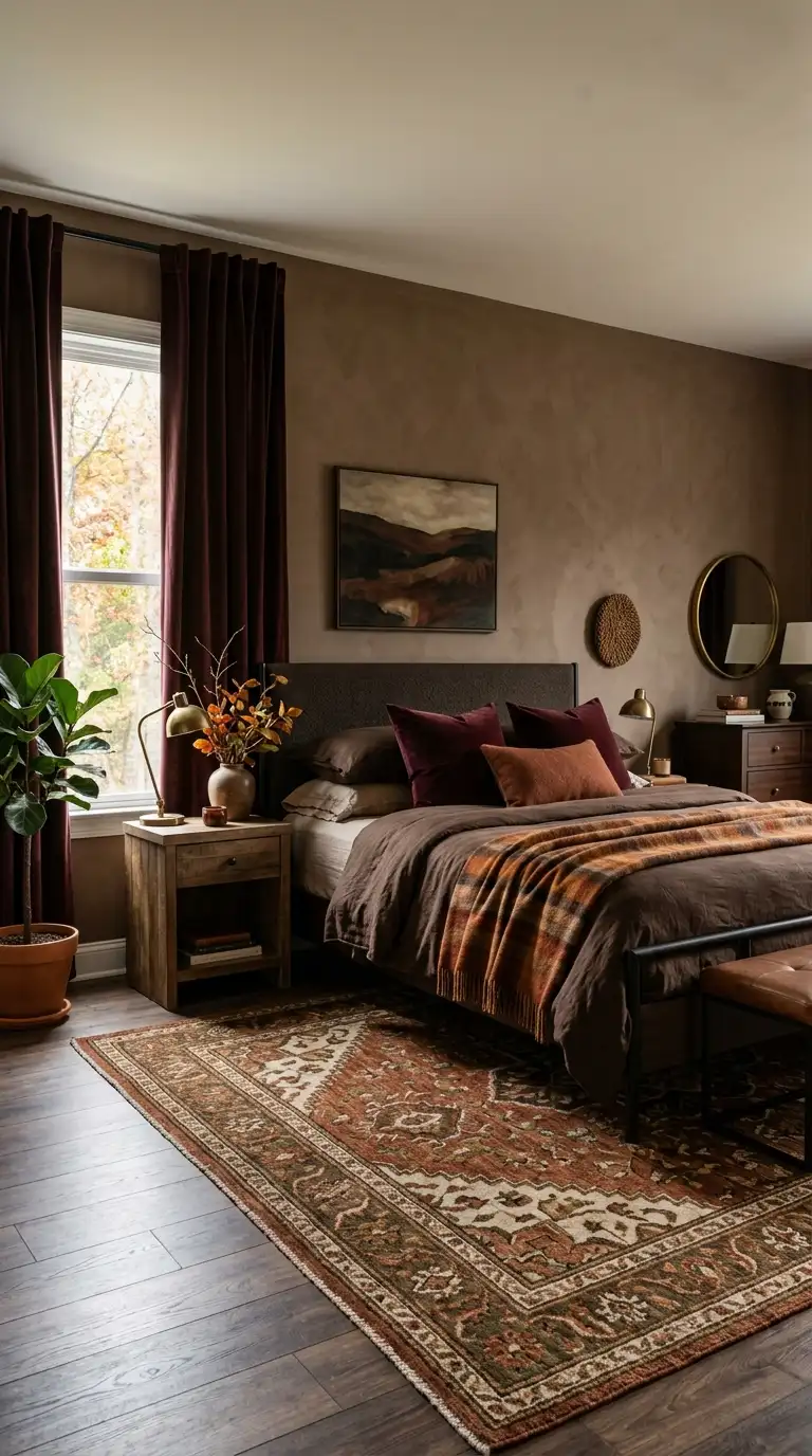


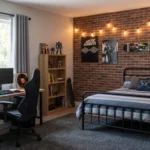
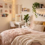
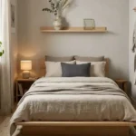
Brown and burgundy together sound like they might clash but the opposite is true. These two tones share enough warmth at their core that they support each other naturally across a whole room.
Think of this palette the way you think about autumn leaves. The transition from rust to burgundy to deep brown is something nature has been perfecting for centuries and it works just as well indoors.
Build the palette from the ground up starting with a warm mid-brown as your dominant wall colour. Then layer in burgundy through bedding, curtains, or an upholstered piece and let the brown serve as the grounding neutral.
Texture is critical in a palette this warm and close in tone. Mixing matte plaster walls with velvet curtains and a woven rug prevents the room from reading as too flat or monotonous.
This combination rewards patience in the layering process. Adding one element at a time and standing back to assess before adding the next is genuinely the best approach here.
16. Deep Teal With Burgundy Bedding
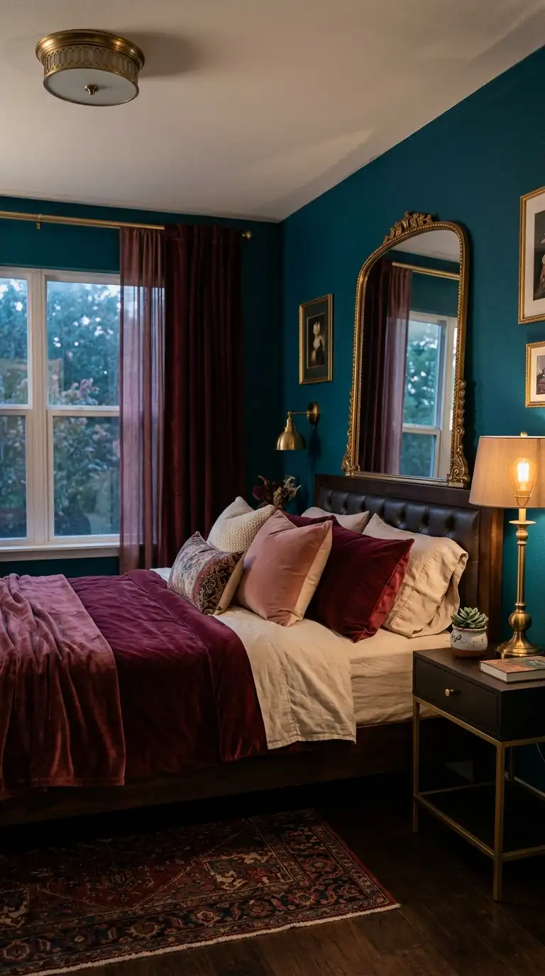
Teal and burgundy is a pairing that operates like a jewel box. Both colours are rich and jewel-toned and together they create a bedroom that feels genuinely luxurious without requiring any actual luxury budget.
Deep teal on the walls sets the foundation as a colour that feels cool on its own but reads as warm and cocooning in a bedroom context. It has that quality of feeling both bold and somehow restful at the same time.
Burgundy bedding in a velvet, waffle, or heavyweight cotton brings in the warmth and contrast the teal needs. Add dusty pink or warm cream as a third textile tone to soften the overall effect.
Gold accents are the secret ingredient that unifies both colours. A gold-framed mirror, brass lamp, or even a gold-toned candle holder connects the teal and burgundy through a shared metallic warmth.
Keep artwork simple in a palette this strong. A single large framed print in complementary tones on the teal wall is more impactful than a gallery of smaller pieces.
17. Vintage Furniture In Rich Tones
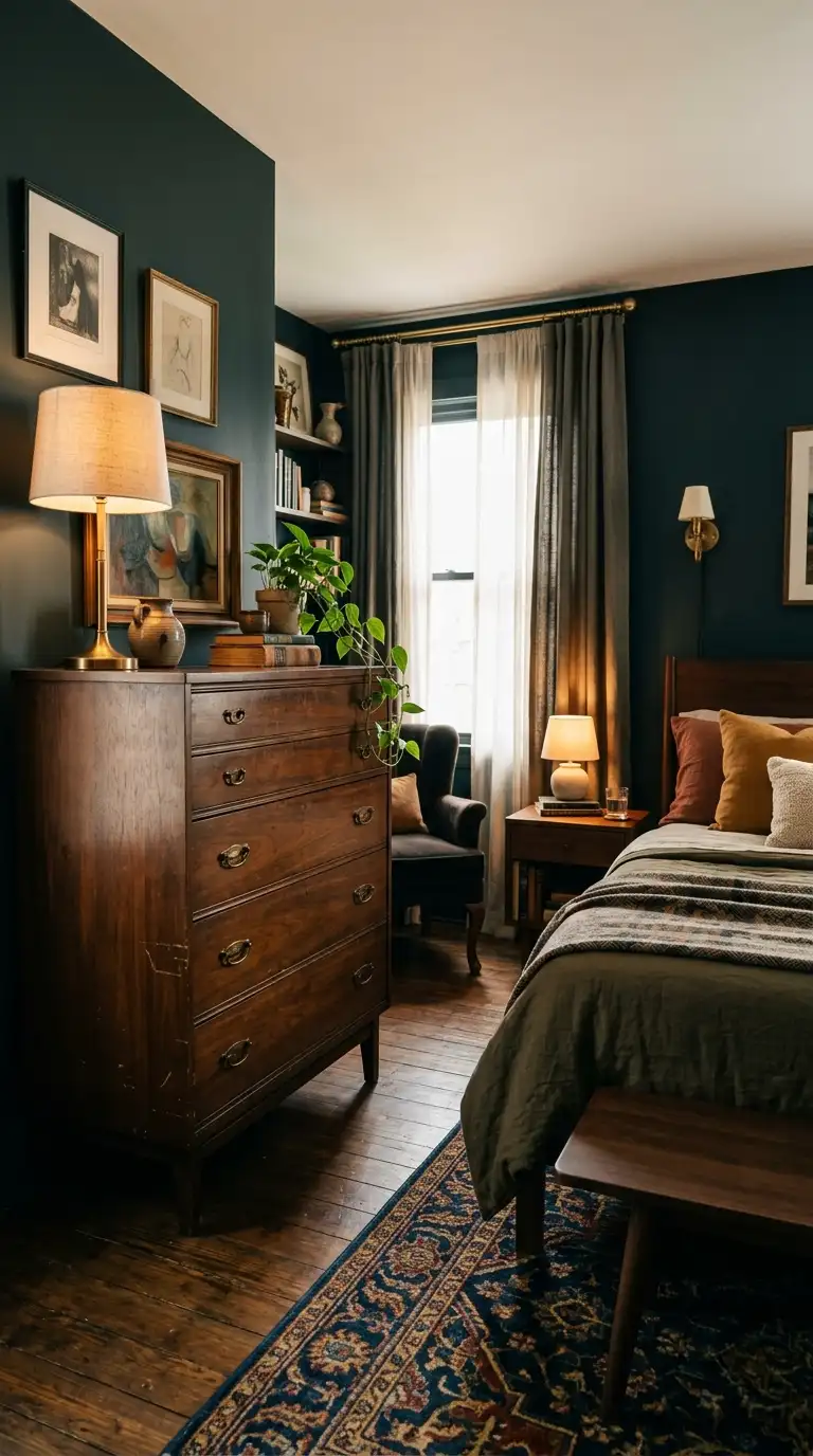
Vintage furniture is the shortcut to a bedroom that looks expensive, characterful, and completely irreplaceable. Nothing from a flat-pack range can compete with the detail and patina of a piece that has genuinely lived a little.
Focus on dark wood tones when sourcing vintage bedroom furniture. Mahogany, walnut, and dark oak all carry that richness that makes a moody bedroom feel properly grounded and intentional.
Check local charity shops, estate sales, and online resale apps before looking at any new furniture retailers. The best finds are rarely in obvious places and the price difference is usually significant.
A vintage chest of drawers with its original brass handles, or an old wooden wardrobe with carved details, instantly elevates a bedroom in a way that modern equivalents struggle to match. The imperfections are part of the charm, not a problem to fix.
Mixing vintage pieces with your existing modern furniture is completely fine and often looks better than a fully matched set. The combination of old and new feels more collected and less like a showroom.
18. Velvet Curtains With Wooden Accents
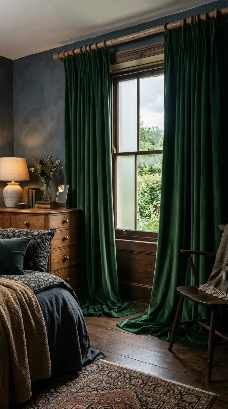
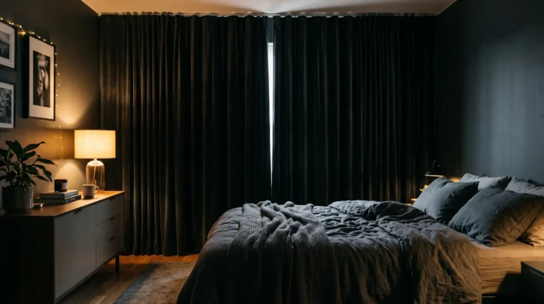
Velvet curtains are one of those things that look extraordinary but actually require very little effort to pull off. The fabric does almost all the work on its own through its texture and the way it absorbs light.
For a moody autumn bedroom, choose curtains in deep jewel tones or very dark neutrals. Forest green, deep teal, plum, dusty rose, and charcoal are all strong options depending on your existing palette.
The wooden accent element is what keeps the velvet from feeling too heavy or formal. A wooden curtain rod rather than metal, or wooden furniture nearby, introduces a warmth that balances the plushness of the velvet.
Hang the curtains high and wide, ideally from as close to the ceiling as possible and extending well past the window frame on both sides. This makes the windows look larger and the room feel more luxurious without changing anything structural.
Floor-length velvet curtains that just skim the floor create a pooling effect that looks very intentional and editorial. It is the kind of detail that people notice without quite knowing why the room looks so good.
19. Warm Neutral Bedding For Contrast
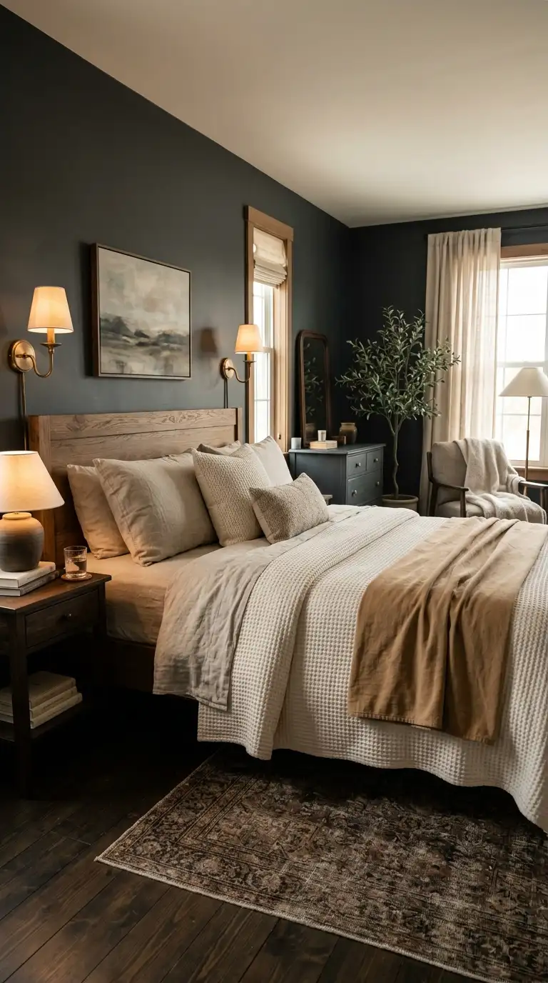
Sometimes the most effective move in a moody bedroom is restraint. When your walls are deeply saturated, warm neutral bedding creates a breathing space that makes the whole room feel more balanced and liveable.
Warm neutrals here means oatmeal, natural linen, ivory, camel, warm cream, and the soft undyed tones of natural fibres. These are neutrals that sit firmly in the warm half of the spectrum and feel nothing like clinical white.
Layer multiple neutrals together in different textures on the bed. A linen duvet cover, a waffle-weave throw, and cotton pillowcases in three slightly different warm tones together create a bed that looks effortlessly styled.
This approach works particularly well with deeply saturated wall colours because it prevents the room from feeling too heavy. The bed becomes a soft, calm anchor point in an otherwise rich and dramatic space.
Neutral bedding also photographs beautifully in warm light which is a bonus that should not be underestimated when you have spent time creating a genuinely beautiful room.
20. Color Drenched Ceiling And Walls
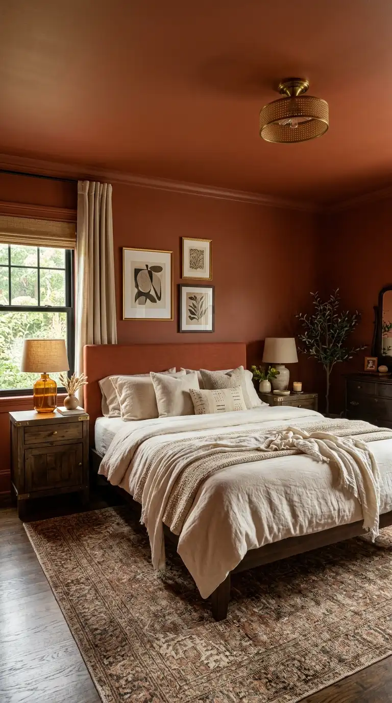
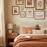
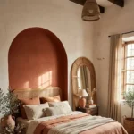
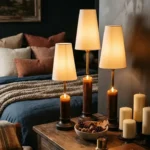
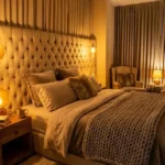
Painting your ceiling the same colour as your walls used to feel like a very daring decision. Now it is one of the most talked-about design choices for good reason because the result is genuinely transformative.
When the ceiling comes down into the same moody tone as the walls, the room loses its visual boundaries and takes on an almost tent-like quality. Cocooning is the word designers always reach for and it is accurate.
This technique works best with rich mid-tones rather than very dark shades in smaller rooms. A deep terracotta, warm olive, or dusty blue ceiling can be dramatic without making a small space feel oppressive.
Paint the trim and architrave in a shade just one or two tones darker than the wall colour rather than contrasting it. This keeps the effect seamless and intentional rather than looking like you ran out of paint.
Furniture and bedding should be lighter than the walls when colour drenching to give the eye a visual rest point. All-dark everything can tip the balance from moody to genuinely gloomy.
21. Dark Academia Inspired Bedroom
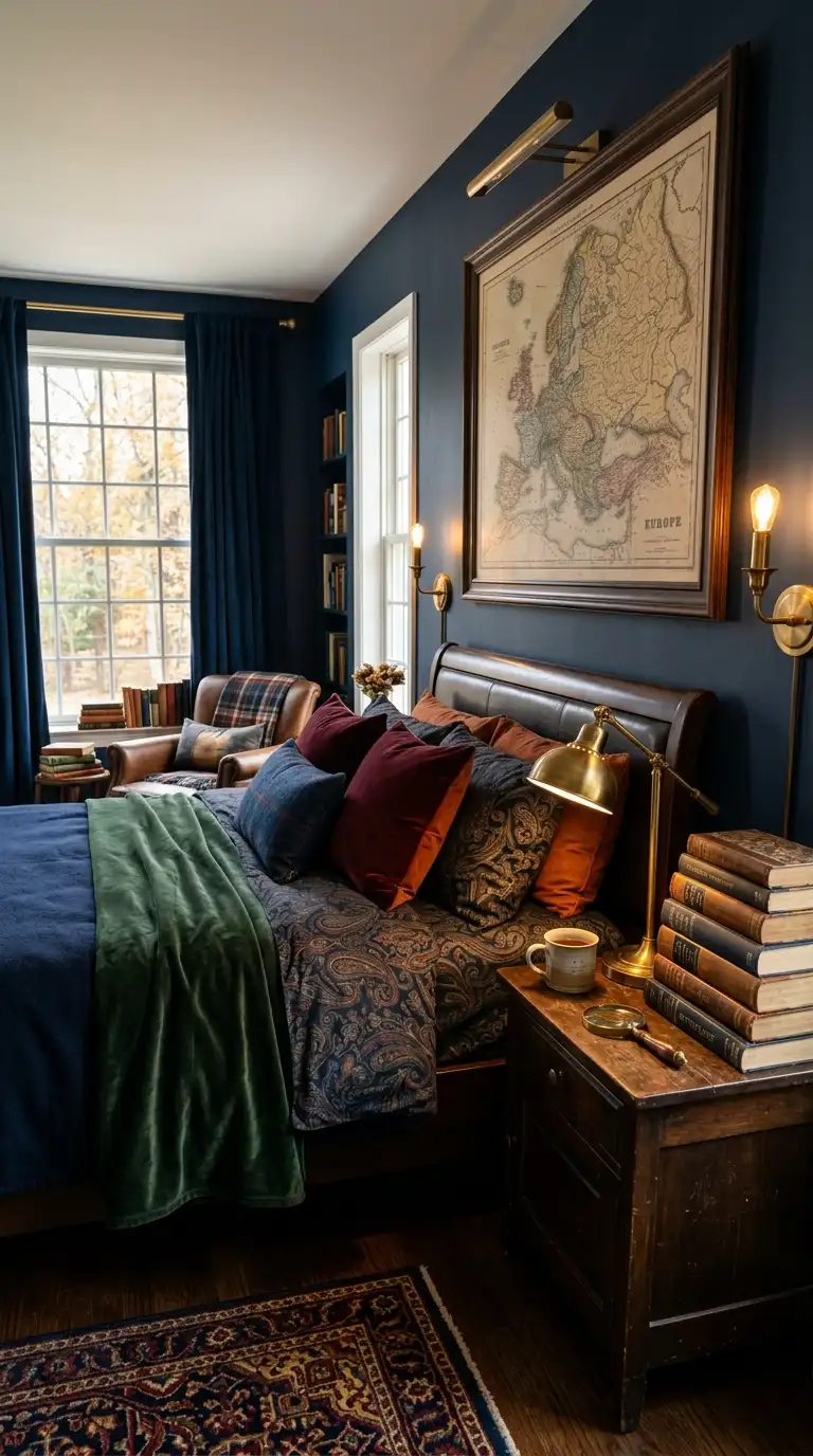
Dark academia as an aesthetic is built around the idea of a space that feels like it is occupied by someone deeply interesting. Books, dark wood, rich tones, and the sense that serious thoughts happen here are all part of the brief.
In a bedroom context this translates to dark walls in forest green, deep burgundy, navy, or charcoal. Pair them with antique wooden furniture, warm brass lighting, and textiles in deep jewel tones or warm neutrals.
Books are part of the aesthetic and not just as decoration. A small stack on the nightstand or a shelf of worn spines above the bed adds authenticity that no prop can replicate.
Framed vintage prints, antique maps, or botanical illustrations in dark frames add the right kind of visual interest to the walls. Skip anything too contemporary or graphic in a dark academia bedroom.
The whole thing should feel slightly inherited and definitely not algorithmic. If it looks like it could have been assembled in an afternoon, lean further into the vintage and the layered details.
22. Moody Bedroom With Sculptural Lamps
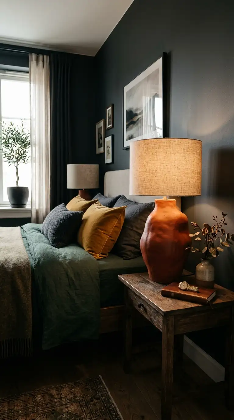
A sculptural lamp is the piece of bedroom decor that pays the most dividends per square inch of space. It functions as art, as light, and as a conversation point simultaneously.
For a moody bedroom specifically, look for lamps with organic or unusual silhouettes rather than generic base-and-shade designs. Mushroom shapes, irregular ceramic bases, and unusual materials all fit the aesthetic.
Placement matters as much as the lamp itself. A tall sculptural floor lamp in a corner creates a completely different quality of light to a table lamp and adds a vertical element that most bedrooms need.
Dark-toned ceramic bases in rust, dark green, near-black, or earthy brown all suit a moody palette. Pair them with a linen or amber glass shade for the warmest possible light quality.
Sculptural lamps from small ceramicists and independent homeware makers tend to be more interesting than mass-market options. Following makers on social media and waiting for restock drops is genuinely worth the patience.
23. Rich Plum Walls With Gold
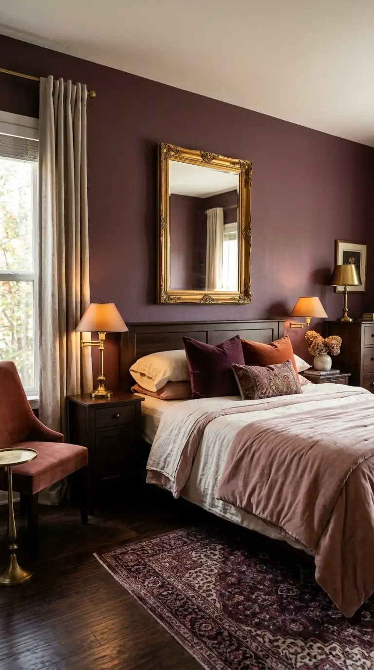
Plum walls with gold accents is a combination that walks the line between boldly maximalist and quietly regal. It is one of those palettes that looks like it required a designer but is actually very achievable on your own.
The key to gold in this context is not going overboard. A single large gold-framed mirror, a pair of brass lamps, and perhaps a few small gold accessories is enough. More than that and the room tips into costume territory.
Choose a plum with warm red undertones rather than blue-leaning purple for this palette. The warm undertone is what makes the gold feel connected to the walls rather than random.
Cream or blush bedding sits between the plum and gold tones perfectly. Avoid white bedding because the coolness fights the warmth of the rest of the palette.
Velvet in any format is the ideal fabric partner for plum and gold. A velvet cushion in deep gold or a plum velvet headboard adds texture that reinforces the richness of the whole room.
24. Olive Walls With Natural Wood
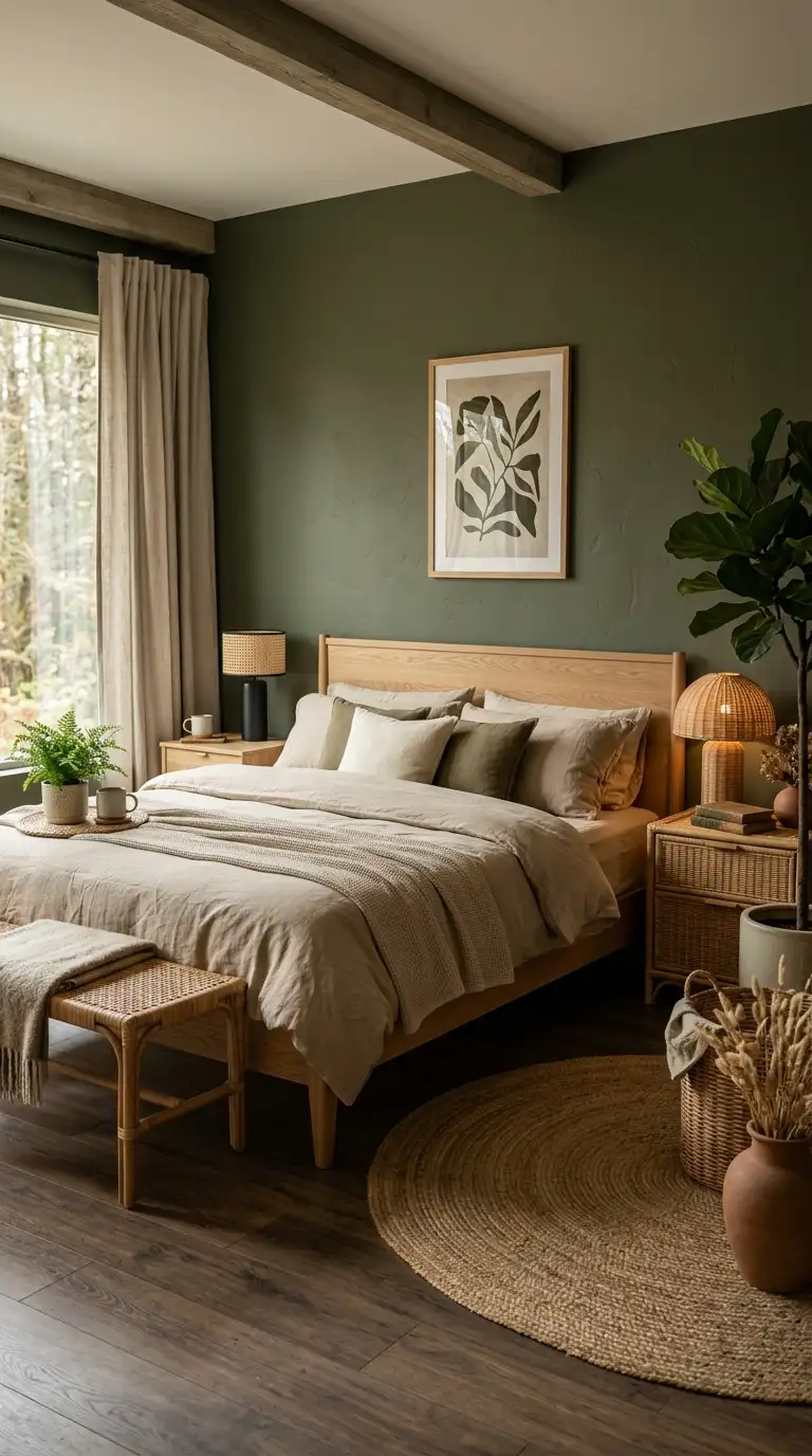
Olive and natural wood is the palette for anyone who wants their bedroom to feel like a boutique hotel deep in the forest. It is warm, organic, and has a calm that is genuinely hard to manufacture with any other combination.
Natural wood here means lighter tones like oak, ash, pine, and bamboo rather than the darker walnuts and mahoganies. The contrast between the depth of olive and the lightness of natural wood is what gives this pairing its energy.
A wooden bed frame in a natural finish is the central piece this palette is built around. Add rattan or wicker accessories for additional organic texture that sits comfortably within the nature-inspired brief.
Linen bedding in sand, oat, or a very warm white keeps the palette grounded. Layer a woven blanket in a complementary terracotta or warm mustard for an additional autumn dimension.
This is a bedroom that also works beautifully year-round because the natural elements make it feel fresh in summer and cosy in winter. An efficient palette in the best possible way.
25. Textured Bedding In Warm Tones
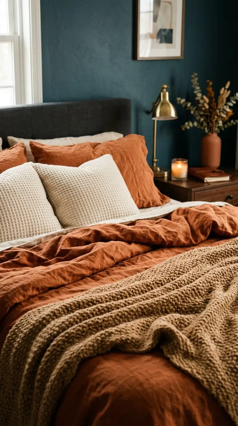
Texture in bedding is the design element that photographs flat but feels spectacular in real life. Running your hand across a well-layered bed of mixed textures is one of the most satisfying sensory experiences a bedroom can offer.
For autumn, build your textured bedding around warm tones specifically. Rust, camel, warm cream, terracotta, and dusty peach all work together in a layered arrangement without requiring any colour theory expertise.
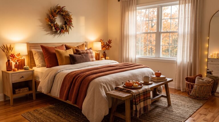
Start with a base of washed linen or cotton in a warm neutral and build up from there. Add a waffle-weave blanket, a chunky knit throw, and pillows in at least two different fabric textures for a bed that looks professionally styled.
The trick to layering without it looking chaotic is keeping all the tones within the same warm family. You can mix patterns very gently such as a subtle stripe with a plain and the warmth of the tones holds everything together.
Invest in good quality base layers and supplement with budget throws and pillows around them. The base layers are what you feel every night while the accessories are what you see and they can be changed seasonally.
26. Canopy Bed With Moody Drapery
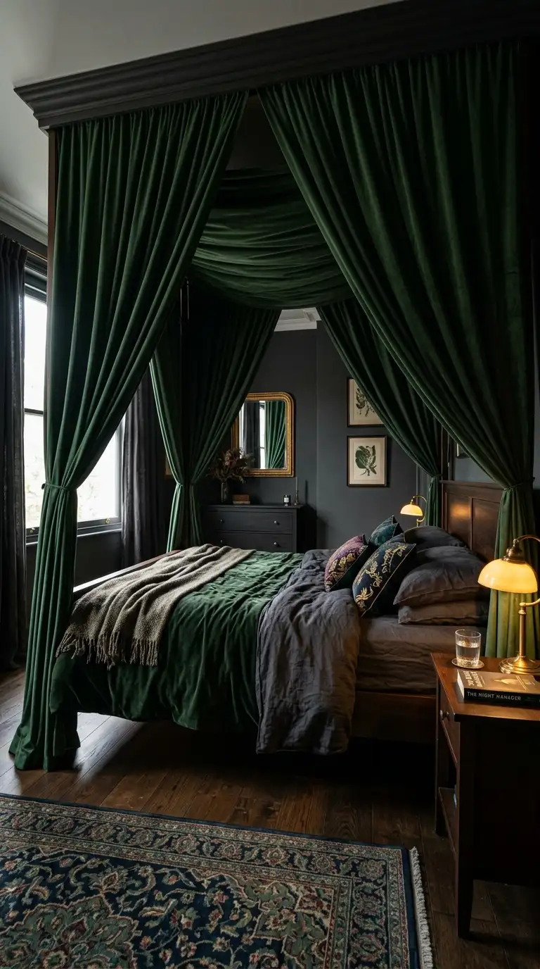
A canopy bed with fabric drapery is the most architectural and theatrical bedroom option on this list. It creates a room within a room and makes going to bed feel like an actual event.
You do not need a built-in canopy structure to achieve this look. A simple ceiling-mounted curtain rod or a set of drapery hooks above the bed can suspend fabric on three or four sides of the bed to create the same effect.
Choose your drapery fabric in a moody tone that complements your wall colour rather than matching it exactly. Deep burgundy drapes against a charcoal wall, or forest green fabric against plum, create a layered depth that matching tones cannot achieve.
Linen and velvet both work beautifully as canopy fabrics for different reasons. Linen is light and slightly sheer which gives an ethereal quality while velvet is heavy and light-absorbing which creates an incredibly dramatic enclosure.
This is the bedroom that makes you genuinely excited to get into bed each evening. Some design ideas are about how a room looks and some are about how a room makes you feel, and a canopy bed with moody drapery is firmly and wonderfully in the second category.